Flatten the COVID-19 curve
Abstract:
We discuss why the message of flattening the COVID-19 curve is right, but why some of the visualizations used to show the effect are wrong: Reducing the basic reproduction number does not just stretch the outbreak, it also reduces the final size of the outbreak. A Shiny app exists to investigate different scenarios.
 This work is licensed under a Creative Commons
Attribution-ShareAlike 4.0 International License. The
markdown+Rknitr source code of this blog is available under a GNU General Public
License (GPL v3) license from github.
This work is licensed under a Creative Commons
Attribution-ShareAlike 4.0 International License. The
markdown+Rknitr source code of this blog is available under a GNU General Public
License (GPL v3) license from github.
Motivation
Current discussions about interventions for the ongoing COVID-19 outbreak talk a lot about flattening the epidemic curve, i.e. to slow down the outbreak dynamics. Because of limited health capacities, stretching out the outbreak over a longer time period will ensure, that a larger proportion of those in need of hospital treatment will actually get it. Other advantages of this approach are to win time in order to find better treatment forms and, possibly, to eventually develop a vaccine. Visualization of the flatten-the-curve-effect often look like this one taken from Twitter:
Our #FlattenTheCurve graphic is now up on (Wikipedia?) with proper attribution & a CC-BY-SA licence. Please share far & wide and translate it into any language you can! Details in the thread below. #Covid_19 #COVID2019 #COVID19 #coronavirus Thanks to (XTOTL?) & (TheSpinoffTV?) pic.twitter.com/BQop7yWu1Q
— Dr Siouxsie Wiles ((SiouxsieW?)) March 10, 2020
The origin of these illustration is discussed here.
As much as I support the message and reasons for flattening the curve, some of the visualizations have shortcomings from an infectious disease modelling point of view: They transport the message that the number of individuals, which -as an result of the outbreak- will need hospitalization, is fixed. Hence, the figure suggests that it’s impossible to avoid a certain number of infected (say 40-70% of the population), but we save lives by stretching out hospital cases over time. Although the conclusion is correct, the premise is IMHO wrong: Reducing the basic reproduction number by drastically reducing contacts or quickly isolating infectious diseases also reduces the size of the outbreak. Also others, like Ben Bolker have pointed out this flaw.
We shall use a simple and common mathematical model from infectious disease modelling to illustrate this point. This model is easily implemented in R - showing how is a secondary objective of this post. The R code of this post is available from github and is nicely visualized interactively by a Shiny App made by Tinu Schneider.
A word of caution at this point: The numbers and illustrations used in this post address the point of visualization and are not an attempt to generate actual policy advice.
Susceptible-Infectious-Recovered modelling
A well-known mathematical model to describe the dynamics of an infectious disease in a population is the so called susceptible-infectious-recovered (SIR) compartment model (Kermack and McKendrick 1927). This model assumes that each individual in the population population belongs to one of three states:
- Susceptible: the individual has not yet had the disease, but is not immune to the disease and thus can become infectious when having an infectious contact with an infected individual
- Infectious: a person currently affected by the disease and able to transmit the disease to others
- Recovered: an infectious person who is not affected anymore by the disease and not able to transmit the disease anymore. No re-infection can occur, i.e. recovered individuals are immune to the disease once they had it.
It is assumed that at time zero everyone is susceptible except for \(m\) individuals, which are infectious at time zero. Once infected an individual becomes infectious and then recovers. Mathematically, we shall by \(S(t)\), \(I(t)\) and \(R(t)\) denote the number of susceptible, infectious and recovered in the population at time \(t\). Furthermore, it is assumed that the population consists of a constant number of \(N\) individuals and at all times \(S(t)+I(t)+R(t)=N\). In other words the population is closed and does not vary over time.
The dynamics in the number of susceptibles, infectious and recovered are now described using the following deterministic ordinary differential equation (ODE) system:
\[ \begin{eqnarray*} \frac{dS(t)}{dt} &=& -\beta S(t) I(t), \\ \frac{dI(t)}{dt} &=& \beta S(t) I(t) - \gamma I(t), \\ \frac{dR(t)}{dt} &=& \gamma I(t). \end{eqnarray*} \]
What does this mean? It denotes the movement of individuals between the three categories, in particular the movement from \(S\rightarrow I\) and \(I \rightarrow R\). The most important term in the equation system is \(\beta S(t) I(t)\) and can be motivated as follows: Consider one specific infectious individual at time \(t\), this individual meets a specific other person in the population at the rate of \(\beta\) contacts per time unit (say day). It is assumed that this rate is the same no matter which other person we talk about (aka. homogeneous mixing in the population). Of course this is a very strong simplification, because it ignores, e.g., the distance between two individuals and that you tend to mix with more with peers. But in a large population, the average is a good description. Hence, the number of contacts with susceptible individuals per time unit is \(\beta S(t)\). Now summing these contacts over all infectious individuals at time \(t\) leads to \(\sum_{j=1}^{I(t)}\beta S(t) = \beta I(t) S(t)\). Note that this is a non-linear term consisting of both \(I(t)\) and \(S(t)\).
In the above process description,for the ease of exposition, it is assumed that once an infectious individual meets a susceptible person, then the disease is always transmitted from the infected to the susceptible person. Hence, the transmission probability does not depend on, e.g., how long the infectious individual has already been infectious. An equivalent way of formulating this statement is to say that each individual has contacts at rate \(\alpha\) for meeting a specific other person, and a proportion \(p\) of these contacts results in an infection. Then \(\beta = \alpha p\) is the rate at which infectious contacts occur.
The second component of the model is the term \(\gamma I(t)\). Again considering one infectious individual it is assumed that the rate at which \(I\rightarrow R\) transition occurs happens at the constant rate \(\gamma\). This means that individuals are on average \(1/\gamma\) days infectious before they recover from the disease. In other words: The smaller \(\gamma\) is the longer people are infectious and, hence, the longer they can transmit the disease to others. Note: Recovering from an epidemic modelling point of view does not distinguish between individuals which recover by becoming healthy or by dying - what is important is that they do not contribute to the spread of the disease anymore.
One important quantity, which can be derived from the above ODE equation system is the so called basic reproduction number, aka. \(R_0\) and is defined as (Diekmann, Heesterbeek, and Britton 2013)
This means that if we consider the dynamics of a disease in generation time, i.e. in a time scale where one time unit is the time period between infection in the primary case and infection in the secondary case, then \(R_0\) denotes the growth factor in the size of the population at the beginning of the outbreak. What is special about the beginning of the outbreak? Well, more or less all contacts an infectious individual has, will be with susceptible individuals. However, once a large part of the population has already been infected, then \(R_0\) does not necessarily describe the expected number of cases per primary case anymore. For the COVID-19 outbreak, since it is assumed that little immunity exists against the disease, all individuals will be susceptible and, hence, almost all contacts an infectious individual has, will be with susceptible persons. However, at a later stage in the epidemic, due to the depletion of susceptibles, the number of secondary cases will be lower. Furthermore, possible interventions as part of the epidemic response along the way might additionally lower the number of secondary cases.
Assuming \(R(0)\) and letting \(I(0)=m\) we obtain \(S(0) = N-m\). We can use this initial
configuration together with a numerical solver for ODEs as implemented,
e.g., in the lsoda function of the R package deSolve
(Soetaert, Petzoldt, and
Setzer 2010). For this, we need to implement a function, which
describes the derivative of the ODE system:
######################################################################
# Function to compute the derivative of the ODE system
#
#  t - time
#  y - current state vector of the ODE at time t
#  parms - Parameter vector used by the ODE system
#
# Returns:
#  list with one component being a vector of length two containing
#  dS(t)/dt and dI(t)/dt
######################################################################

sir <- function(t, y, parms) {
  beta <- parms[1]
  gamma <- parms[2]
  S <- y[1]
  I <- y[2]
  return(list(c(S = -beta * S * I, I = beta * S * I - gamma * I)))
}
# Population size
N <- 1e6
# Rate at which person stays in the infectious compartment (disease specific and tracing specific)
gamma <- 1/5
# Infectious contact rate - beta = R0/N*gamma and when R0 \approx 2.25 then 2.25/N*gamma
beta <- 4.5e-07
# R0 for the beta and gamma values
R0 <- beta*N/gammaAssuming a hypothetical population of \(N = 1,000,000\) and a contact rate of \(\beta = 0.0000004\) means that the contact rate with a given individual is 0.0000004 contacts per day. The choice of \(\gamma = 0.2\) corresponds to an average length of the infective period of 5 days. Altogether, this leads to an \(R_0\) of 2.25, which roughly corresponds to the \(R_0\) of SARS-CoV-2.
We can now solve the ODE system using the above parameters and an initial number of infectious of, say, 10:
# Load package to numerically solve ODEs
suppressPackageStartupMessages(library(deSolve))

# Grid where to evaluate
max_time <- 150
times <- seq(0, max_time, by=0.01)

# Solve ODE system using Runge-Kutta numerical method.
ode_solution <- rk4(y = c(N - 10, 10), times = times, func = sir, parms = c(beta, gamma)) %>%
    as.data.frame() %>%
    setNames(c("t", "S", "I")) %>%
    mutate(beta = beta, gama = gamma, R0 = N * beta / gamma, s = S / N, i = I / N, type = "without_intervention")
Here we have introduced \(s(t) = S(t)/N\) and \(i(t) = I(t)/N\) as, respectively, the proportion of susceptible and infectious individuals in the population. Note that \(I(t)\) is the number of currently infectious persons. Since a person is usually infectious for more than one day this curve is not equivalent to the number of new infections per day. If interest is in this value, which would typically be what is reported by health authorities, this can be computed as \[ C(t) = \int_{t-1}^t \beta S(u) I(u) du. \] or due to the SIR structure where re-infections are not possible simply as \(S(t-1) - S(t)\).
The epidemic curve of new infections per day is shown below:

Another important quantity of the model is an estimate for how many individuals are ultimately infected by the disease, i.e. \(1-s(\infty)\) in a population where initially everyone is susceptible to the disease. This can be either calculated numerically from the above output as:
(1 - tail(ode_solution, n=1) %>% pull(s)) ## [1] 0.8534244or by numerically solving the following recursive equation (Diekmann, Heesterbeek, and Britton 2013, 15): \[ s(\infty) = \exp(-R_0 (1-s(\infty))) \] using R:
# Function to compute the final size.
s_inf <- function(R0) {

  f_target <- function(x) { x - exp(-R0*(1-x)) }

  result <- uniroot(f_target, lower=1e-12, upper=1-1e-12)$root

  return(result)
}

# Final proportion of infected.
1 - s_inf(R0)
## [1] 0.8534382We can use the above equation to verify that the larger \(R_0\), the larger is the final size of the outbreak:
R0_grid <- c(1.25, 1.5, 1.75,2, 2.25, 2.5, 3)
map_dbl( R0_grid, ~ 1-s_inf(.x)) %>% setNames(R0_grid) %>% scales::percent(accuracy=1)
## 1.25 1.5 1.75 2 2.25 2.5 3
## "37%" "58%" "71%" "80%" "85%" "89%" "94%"However, despite a value of \(R_0>1\), not the entire population will be infected, because of the depletion of susceptibles. Hence, the exponential growth rate interpretation of \(R_0\) is only valid at the beginning of an outbreak.
Reducing \(R_0\)
As we could see from the equation defining \(R_0\) in our simple SIR-model, there are two ways to reduce the \(R_0\) of a disease:
- Reduce the number of contacts persons have with each-other, i.e. make \(\beta\) smaller
- Reduce the duration for how long people are effectively spreading the disease (e.g. by quarantine), i.e. reduce the average duration \(\gamma\) of how long infectious individuals can infect others.
For simplicity we shall only be interested in the first case and will pursue the following very simple strategy, where the different measures only depend on time:
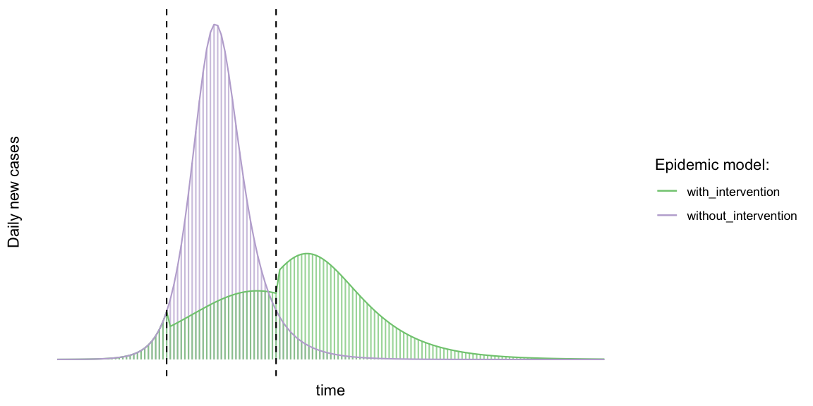
\[ \beta(t) = \left\{ \begin{array}{} \beta_0 & \text{if } t\leq t_1, \\ \beta_1 & \text{if } t_1 < t\leq t_2, \\ \beta_2 & \text{if } t_2 < t \end{array} \right. \] where \(\beta_0\) is the ordinary \(\beta\) value of the disease. We will use a large reduction of the contacts within the interval \([t_1, t_2]\) and thus \(\beta_1 < \beta_0\). After some time, the control measures are reduced slightly, i.e. \(\beta_1 < \beta_2 < \beta_0\). We shall use \(\beta_1 = r_1 \beta_0\) and \(\beta_2 = r_2 \beta_0\) with \(r_1 \leq r_2\). The two epidemic curves can now be plotted as follows:
The final size in the two cases:
## # A tibble: 2 x 2
## # Groups:   type [2]
##   type                 final_fraction
##   <chr>                <chr>
## 1 without_intervention 85%
## 2 with_intervention    68%
Here we used the very conservative estimates that \(R_0\) can be reduced by 60% to 1.35 for a few weeks, hereafter the reduction is 80% of the original \(R_0\), i.e. 1.8. Things of course become more optimistic, the larger the reduction is. One danger is although to reduce \(R_0\) drastically and then lift the measures too early and too much - in this case the outbreak is delayed, but then almost of the same peak size and final size, only later.
The simple analysis in this post shows that the final size proportion with interventions is several percentage points smaller than without interventions. The larger the interventions, if done right and timed right, the smaller the final size. In other words: the spread of an infectious disease in a population is a dynamic phenomena. Time matters. The timing of interventions matters. If done correctly, they stretch the outbreak and reduce the final size!
Discussion
The epidemic model based approaches to flatten the curve shows that the effect of reducing the basic reproduction number is not just to stretch out the outbreak, but also to limit the size of the outbreak. This is an aspect which seems to be ignored in some visualizations of the effect.
The simple SIR model used in this post suffers from a number of limitations: It is a deterministic construction averaging over many stochastic phenomena. However, at the large scale of the outbreak we are now talking about, this simplification appears acceptable. Furthermore, it assumes homogeneous mixing between individuals, which is way too simple. Dividing the population into age-groups as well as their geographic locations and modelling the interaction between these groups would be a more realistic reflection of how the population is shaped. Again, for the purpose of the visualization of the flatten-the-curve effect again I think a simple model is OK. More involved modelling covering the establishment of the disease as endemic in the population are beyond this post, so is the effectiveness of the case-tracing. For more background on the modelling see for example the YouTube video about the The Mathematics of the Coronavirus Outbreak by my colleague Tom Britton or the work by Fraser et al. (2004).
It is worth pointing out that mathematical models are only tools to gain insight. They are based on assumptions which are likely to be wrong. The question is, if a violation is crucial or if the component is still adequately captured by the model. A famous quote says: All models are wrong, but some are useful… Useful in this case is the message: flatten the curve by reducing infectious contacts and by efficient contact tracing.
Update 2020-03-18: Tinu Schneider from Switzerland used the GitHub code of this post to program a small Shiny app allowing one to study the impact of changing the parameters. Check it out!