World Income, Inequality and Murder
Abstract:
We follow up on last weeks post on using Gapminder data to study the
world’s income distribution. In order to assess the inequality of the
distribution we compute the Gini coefficient for the world’s income
distribution by Monte Carlo approximation and visualize the result as a
time series. Furthermore, we animate the association between Gini
coefficient and homicide rate per country using the new version of
gganimate.
 This work is licensed under a Creative Commons
Attribution-ShareAlike 4.0 International License. The
markdown+Rknitr source code of this blog is available under a GNU General Public
License (GPL v3) license from github.
This work is licensed under a Creative Commons
Attribution-ShareAlike 4.0 International License. The
markdown+Rknitr source code of this blog is available under a GNU General Public
License (GPL v3) license from github.
Introduction
One of the main messages of the Chapter ‘The Gap Instinct’ of the book Factfulness is that there is no justification of the ‘we’ and ‘them’ classification of countries anymore, because ‘they’ have converged towards the same levels in key indicators such as life expectancy, child mortality, births per female. The difference between countries is, hence, not as many imagine it to be: there is less inequality and no real gap. While reading, I became curious about the following: what if countries became more equal, but simultaneously inequality within countries became bigger? This was also indirectly a Disqus comment by F. Weidemann to the post Factfulness: Building Gapminder Income Mountains. Aim of the present post is to investigate this hypothesis using the Gapminder data by calculating Gini coefficients. Furthermore, we use the country specific Gini coefficients to investigate the association with the number of homicides in the country.
Gini coefficient
There are different ways to measure income inequality, both in terms of which response you consider and which statistical summary you compute for it. Not going into the details of these discussion we use the GDP/capita in Purchasing Power Parities (PPP) measured in so called international dollars (fixed prices 2011). In other words, comparison between years and countries are possible, because the response is adjusted for inflation and differences in price of living.
The Gini coefficient is a statistical measure to quantify inequality. In what follows we shall focus on computing the Gini coefficient for a continuous probability distribution with a known probability density function. Let the probability density function of the non-negative continuous income distribution be defined by \(f\), then the Gini coefficient is given as half the relative mean difference:
\[ G = \frac{1}{2\mu}\int_0^\infty \int_0^\infty |x-y| \> f(x) \> f(y) \> dx\> dy, \quad\text{where}\quad \mu = \int_{0}^\infty x\cdot f(x) dx. \]
Depending on \(f\) it might be possible to solve these integrals analytically, however, a straightforward computational approach is to use Monte Carlo sampling - as we shall see shortly. Personally, I find the above relative mean difference presentation of the Gini index much more intuitive than the area argument using the Lorenz curve. From the eqution it also becomes clear that the Gini coefficient is invariant to multiplicative changes in the income: if everybody increases their income by factor \(k>0\) then the Gini coefficient remains the same, because \(|k x - k y| = k | x - y|\) and \(E(k \cdot X) = k \mu\) and, hence, \(k\) cancels from numerator and denominator.
The above formula indirectly also states how to compute the Gini coefficient for a discrete sample of size \(n\) and with incomes \(x_1,\ldots, x_n\): \[ G = \frac{\sum_{i=1}^n \sum_{j=1}^n |x_i - x_j| \frac{1}{n} \frac{1}{n}}{2 \sum_{i=1}^n x_i \frac{1}{n}} = \frac{\sum_{i=1}^n \sum_{j=1}^n |x_i - x_j|}{2 n \sum_{j=1}^n x_j}. \]
Approximating the integral by Monte Carlo
If one is able to easily sample from \(f\) then can instead of solving the integral analytically use \(k\) pairs \((x,y)\) both drawn at random from \(f\) to approximate the double integral:
\[ G \approx \frac{1}{2\mu K} \sum_{k=1}^K |x_k - y_k|, \quad\text{where}\quad x_k \stackrel{\text{iid}}{\sim} f \text{ and } y_k \stackrel{\text{iid}}{\sim} f, \] where for our mixture model \[ \mu = \sum_{i=1}^{192} w_i \> E(X_i) = \sum_{i=1}^{192} w_i \exp\left(\mu_i + \frac{1}{2}\sigma_i^2\right). \] This allows us to compute \(G\) even in case of a complex \(f\) such as the log-normal mixture distribution. As always, the larger \(K\) is, the better the Monte Carlo approximation is.
##Precision of Monte Carlo approx is controlled by the number of samples
K <- 1e6

##Compute Gini index of world income per year
gini_year <- gm %>% group_by(year) %>% do({
  x <- rmix(K, meanlog=.$meanlog, sdlog= .$sdlog, w=.$w)
  y <- rmix(K, meanlog=.$meanlog, sdlog= .$sdlog, w=.$w)
  int <- mean( abs(x-y) )
  mu <- sum(exp( .$meanlog + 1/2 * .$sdlog^2) * .$w)
  data.frame(gini_all_mc=1/(2*mu)*int,
             country_gini=gini(.$gdp*.$population))
}) %>%
  rename(`World Population GDP/capita`=gini_all_mc, `Country GDP/capita`=country_gini)

##Convert to long format
gini_ts <- gini_year %>% gather(key="type", value="gini", -year)
Results
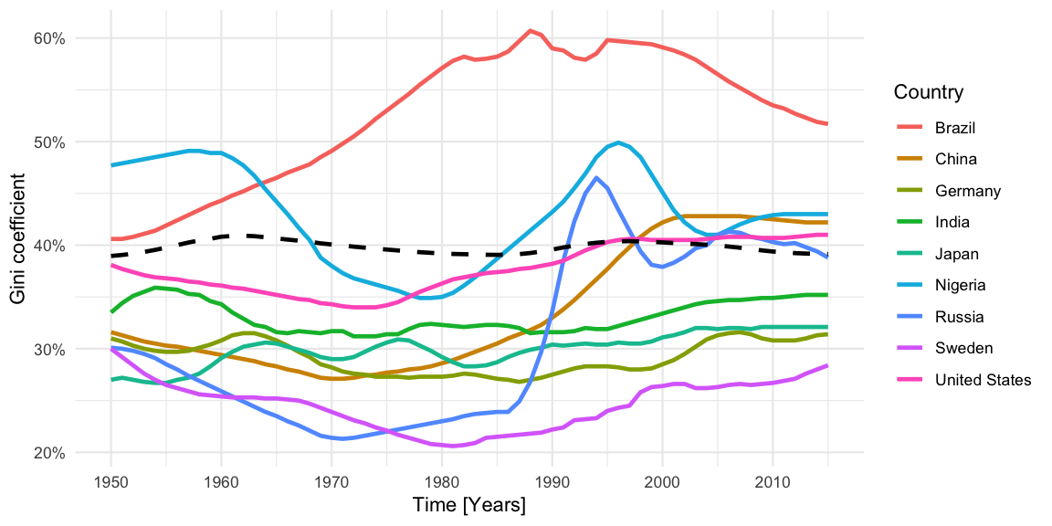
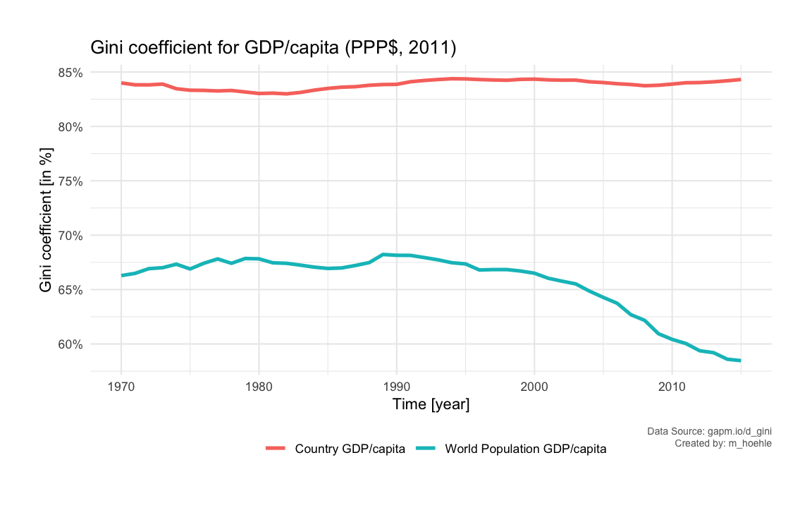
We start by showing the country specific Gini coefficient per year since 1950 for a somewhat arbitrary selection of countries. The dashed black line shows the mean Gini coefficient each year over all 192 country specific Gini coefficients in the dataset.
In addition, we compute and show as time series the Gini coefficient of the 192 countries’ GDP/capita per year. Furthermore, we show the Monte Carlo computed Gini coefficient for the world’s income distribution given as a log-normal mixture with 192 components.
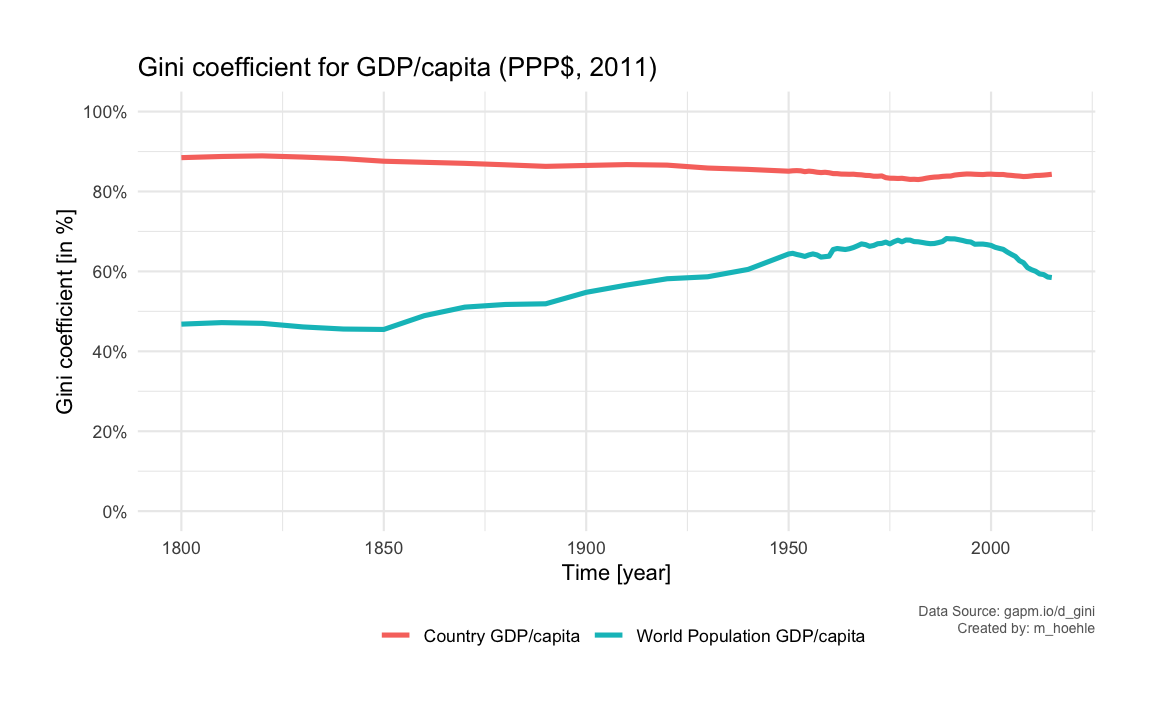
We notice that the Gini coefficient for the 192 countries’ GDP/capita remains very stable over time. This, however, does not take the large differences in populations between countries into account. A fairer measure is thus the Gini coefficient for the world’s income distribution. We see that this Gini coefficient increased over time until peaking around 1990. From then on it has declined. However, the pre-1950 Gini coefficients are rather guesstimates as stated by Gapminder, hence, we zoom in on the period from 1970, because data are more reliable from this point on.
Gini coefficient and Homicide Rate
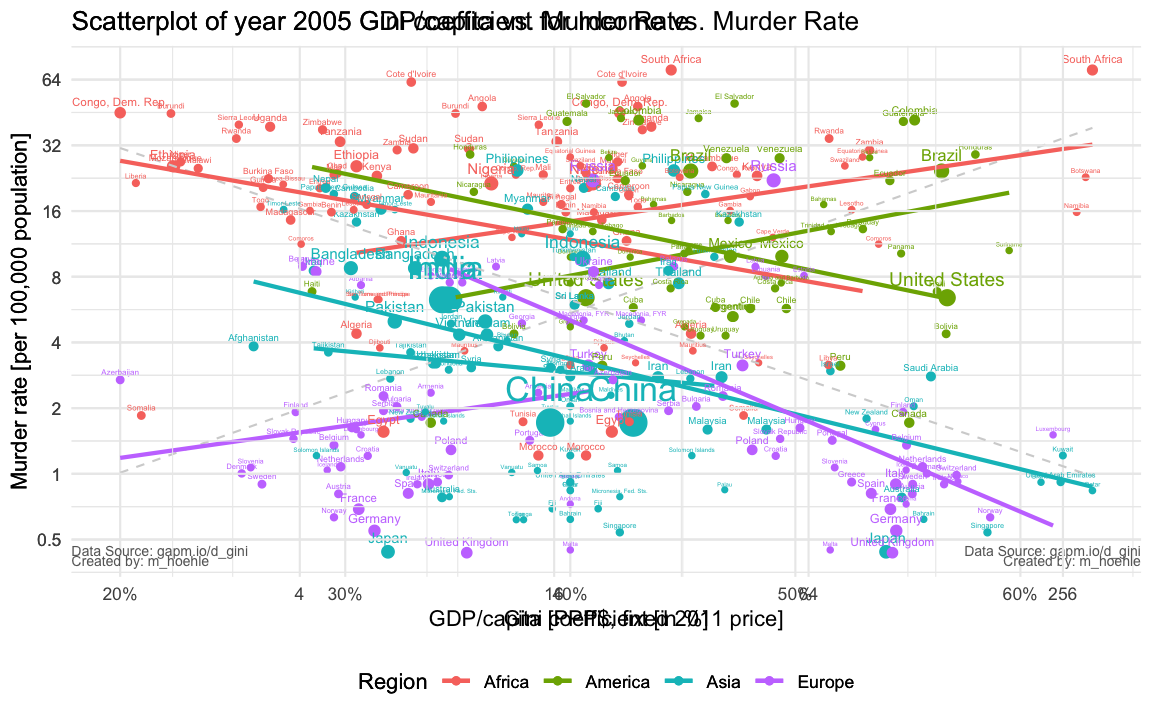
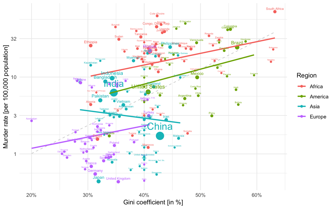
Finally, we end the post by illustrating the association between the Gini coefficient and the homicide rate per country using a 2D scatterplot over the years. The Gapminder data download page also contains data for this for the years 1950- 2005. Unfortunately, no data for more recent years are available from the Gapminder homepage, but the plot shown below is the situation in 2005 with a log-base-10 y-axis for the homicide rates. For each of the four Gapminder regional groups we also fit a simple linear regression line to the points of all countries within the region. Findings such as Fajnzylber, Lederman, and Loayza (2002) suggest that there is a strong positive correlation between Gini coefficient and homicide rate. To illustrate this the thin dashed line is the result of a linear regression (on the log-base-10 scale) for all data points. However, we see from the plot that there are regional differences even having a reversed sign of the relationship. Of course correlation does not imply causality and explanations for this relationship are debated and beyond the scope of this post.
We extend the plots to all years 1950-2005. Unfortunately, not all
countries are available every year - so we only plot the available
countries each year. This means that many African countries are missing
from the animation. An improvement would be to try some form of linear
interpolation. Furthermore, for the sake of simplicity of illustration,
we fix countries with a reported murder rate of zero in a given year
(happens for example for Cyprus, Iceland, Fiji in some years) to 0.01
per 100,000 population. This can be nicely animated using the new
version of the gganimate
package by Thomas Lin
Pedersen.
## New version of gganimate. Not on CRAN yet.
## devtools::install_github('thomasp85/gganimate')
require(gganimate)

p <- ggplot(gm2_nozero, aes(x=gini, y=murder_rate,size=population, color=Region)) +
  geom_point() +
  scale_x_continuous(labels=scales::percent) +
  scale_y_continuous(trans="log10",
                     breaks = trans_breaks("log10", function(x) 10^x,n=5),
                     labels = trans_format("log10", function(x) ifelse(x<0, sprintf(paste0("%.",ifelse(is.na(x),"0",round(abs(x))),"f"),10^x), sprintf("%.0f",10^x)))) +
  geom_smooth(se=FALSE, method="lm", formula=y~x) +
  geom_text(data=gm2, aes(x=gini,y=murder_rate, label=country), vjust=-0.9, show.legend=FALSE) +
  ylab("Murder rate [per 100,000 population]") +
  xlab("Gini coefficient [in %]") +
  guides(size=FALSE) +
  labs(title = 'Year: {frame_time}') +
  transition_time(year) +
  shadow_wake(wake_length=0.15, exclude_layer=c(2,3)) +
  ease_aes('linear')

animate(p, nframes=length(unique(gm2$year)), fps=4, width=800, height=400, res=100)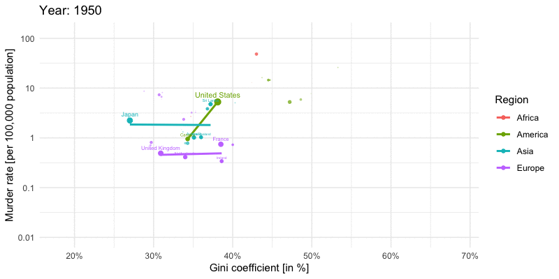
Discussion
Based on the available Gapminder data we showed that in the last 25 years the Gini coefficient for the world’s income distribution has decreased. For several individual countries opposite dynamics are, however, observed. One particular concern is the share that the richest 1% have of the overall wealth: more than 50%.