Factfulness: Building Gapminder Income Mountains
Abstract:
We work out the math behind the so called income mountain plots used in the book “Factfulness” by Hans Rosling and use these insight to generate such plots using tidyverse code. The trip includes a mixture of log-normals, the density transformation theorem, histogram vs. density and then skipping all those details again to make nice moving mountain plots.
 This work is licensed under a Creative Commons
Attribution-ShareAlike 4.0 International License. The
markdown+Rknitr source code of this blog is available under a GNU General Public
License (GPL v3) license from github.
This work is licensed under a Creative Commons
Attribution-ShareAlike 4.0 International License. The
markdown+Rknitr source code of this blog is available under a GNU General Public
License (GPL v3) license from github.
Introduction
Reading the book Factfulness by Hans Rosling seemed like a good thing to do during the summer months. The ‘possibilistic’ writing style is contagious and his TedEx presentations and media interviews are legendary teaching material on how to support your arguments with data. What a shame he passed away in 2017.
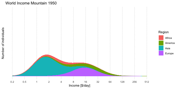
What is really enjoyable about the book is that the Gapminder web page allows you to study many of the graphs from the book interactively and contains the data for download. Being a fan of transparency and reproducibility, I got interested in the so called income mountain plots, which show how incomes are distributed within individuals of a population:
One notices that the “mountains” are plotted on a log-base-2 x-axis
and without a y-axis annotation. Why? Furthermore, world income data
usually involve mean income per country, so I got curious how/if these
plots were made without access to finer granularity level data? Aim of
this blog post is to answer these questions by using Gapminder data
freely available from their webpage. The answer ended up as a nice
tidyverse exercise and could serve as motivating
application for basic probability course content.
Data Munging Gapminder
Data on income, population and Gini coefficient were needed to analyse the above formulated questions. I have done this previously in order to visualize the Olympic Medal Table Gapminder Style. We start by downloading the GDP data, which is the annual gross domestic product per capita by Purchasing Power Parities (PPP) measured in international dollars, fixed 2011 prices. Hence, the inflation over the years and differences in the cost of living between countries is accounted for and can thus be compared - see the Gapminder documentation for further details. We download the data from Gapminder where they are available in wide format as Excel-file. For tidyverse handling we reshape them into long format.
##Download gdp data from gapminder - available under a CC BY-4 license.
if (!file.exists(file.path(fullFigPath, "gapminder-gdp.xlsx"))) {
  download.file("https://github.com/Gapminder-Indicators/gdppc_cppp/raw/master/gdppc_cppp-by-gapminder.xlsx", destfile=file.path(fullFigPath,"gapminder-gdp.xlsx"))
}

gdp_long <- readxl::read_xlsx(file.path(fullFigPath, "gapminder-gdp.xlsx"), sheet=2) %>%
  rename(country=`geo.name`) %>%
  select(-geo,-indicator,-indicator.name) %>%
  gather(key="year", value="gdp", -country,) %>%
  filter(!is.na(gdp))
Furthermore, we rescale GDP per year to daily income, because this is the unit used in the book.
gdp_long %<>% mutate(gdp = gdp / 365.25)Similar code segments are written for (see the code on github for details)
- the gini (
gini_long) and population (pop_long) data - the regional group (=continent) each country belongs two
(
group)
The four data sources are then joined into one long tibble
gm. For each year we also compute the fraction a country’s
population makes up of the world population that year (column
w) as well as the fraction within the year and region the
population makes up (column w_region) :
## # A tibble: 15,552 x 9
##   country     region code  year   gini   gdp population          w  w_region
##   <chr>       <chr>  <chr> <chr> <dbl> <dbl>      <dbl>      <dbl>     <dbl>
## 1 Afghanistan Asia   AFG   1800  0.305  1.65    3280000 0.00347    0.00518
## 2 Albania     Europe ALB   1800  0.389  1.83     410445 0.000434   0.00192
## 3 Algeria     Africa DZA   1800  0.562  1.96    2503218 0.00264    0.0342
## 4 Andorra     Europe AND   1800  0.4    3.28       2654 0.00000280 0.0000124
## 5 Angola      Africa AGO   1800  0.477  1.69    1567028 0.00166    0.0214
## # ... with 1.555e+04 more rows
Income Mountain Plots
The construction of the income mountain plots is thoroughly described on the Gapminder webpage, but without mathematical detail. With respect to the math it says: “Bas van Leeuwen shared his formulas with us and explained how to the math from ginis and mean income, to accumulated distribution shapes on a logarithmic scale.” Unfortunately, the formulas are not shared with the reader. It’s not black magic though: The income distribution of a country is assumed to be log-normal with a given mean \(\mu\) and standard deviation \(\sigma\) on the log-scale, i.e. \(X \sim \operatorname{LogN}(\mu,\sigma^2)\). From knowing the mean income \(\overline{x}\) of the distribution as well as the Gini index \(G\) of the distribution, one can show that it’s possible to directly infer \((\mu, \sigma)\) of the log-normal distribution.
Because the Gini index of the log-normal distribution is given by \[ G = 2\Phi\left(\frac{\sigma}{\sqrt{2}}\right)-1, \] where \(\Phi\) denotes the CDF of the standard normal distribution, and by knowing that the expectation of the log-normal is \(E(X) = \exp(\mu + \frac{1}{2}\sigma^2)\), it is possible to determine \((\mu,\sigma)\) as:
\[ \sigma = \sqrt{2}\> \Phi^{-1}\left(\frac{G+1}{2}\right) \quad\text{and}\quad \mu = \log(\overline{x}) - \frac{1}{2} \sigma^2. \]
We can use this to determine the parameters of the log-normal for every country in each year.
Mixture distribution
The income distribution of a set of countries is now given as a Mixture distribution of log-normals, i.e. one component for each of the countries in the set with a weight proportional to the population of the country. As an example, the world income distribution would be a mixture of the 192 countries in the Gapminder dataset, i.e.
\[
f_{\text{mix}}(x) = \sum_{i=1}^{192} w_i \>\cdot
\>f_{\operatorname{LogN}}(x; \mu_i, \sigma_i^2), \quad\text{where}
\quad w_i = \frac{\text{population}_i}{\sum_{j=1}^{192}
\text{population}_j},
\] and \(f_{\operatorname{LogN}}(x;
\mu_i, \sigma_i^2)\) is the density of the log-normal
distribution with country specific parameters. Note that we could have
equally used the mixture approach to define the income of, e.g., a
continent region. With the above definition we define standard
R-functions for computing the PDF (dmix), CDF
(pmix), quantile function (qmix) and a
function for sampling from the distribution (rmix) - see
the github
code for details.
We use the mixture approach to compute the density of the world income distribution obtained by “mixing” all 192 log-normal distributions. This is shown below for the World income distribution of the year 2015. Note the \(\log_2\) x-axis. This presentation is Factfulness’ preferred way of illustrating the skew income distribution.
##Restrict to year 2015
gm_recent <- gm %>% filter(year == 2015) %>% ungroup

##Make a data frame containing the densities of each region for
##the gm_recent dataset
df_pdf <- data.frame(log2x=seq(-2,9,by=0.05)) %>%
  mutate(x=2^log2x)

pdf_region <- gm_recent %>% group_by(region) %>% do({
  pdf <- dmix(df_pdf$x, meanlog=.$meanlog, sdlog=.$sdlog, w=.$w_region)
  data.frame(x=df_pdf$x, pdf=pdf, w=sum(.$w), population=sum(.$population), w_pdf = pdf*sum(.$w))
})

## Total is the sum over all regions - note the summation is done on
## the original income scale and NOT the log_2 scale. However, one can show that in the special case the result on the log-base-2-scale is the same as summing the individual log-base-2 transformed densities (see hidden CHECKMIXTUREPROPERTIES chunk).

pdf_total <- pdf_region %>% group_by(x) %>%
  summarise(region="Total",w=sum(w), pdf = sum(w_pdf))

## Expectation of the distribution
mean_mix <- gm_recent %>%
  summarise(mean=sum(w * exp(meanlog + 1/2*sdlog^2))) %$% mean

## Median of the distribution
median_mix <- qmix(0.5, gm_recent$meanlog, gm_recent$sdlog, gm_recent$w)

## Mode of the distribution on the log2-scale (not transformation invariant!)
mode_mix <- pdf_total %>%
  mutate(pdf_log2x = log(2) * x * pdf) %>%
  filter(pdf_log2x == max(pdf_log2x)) %$% x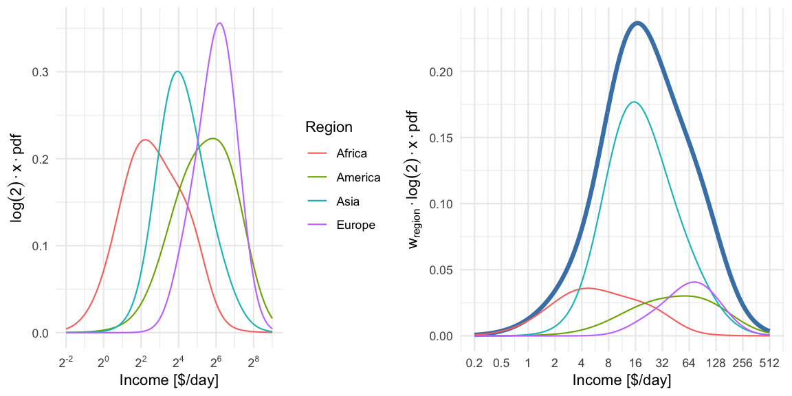
For illustration we compute a mixture distribution for each region using all countries within region. This is shown in the left pane. Note: because a log-base-2-transformation is used for the x-axis, we need to perform a change of variables, i.e. we compute the density for \(Y=\log_2(X)=g(X)\) where \(X\sim f_{\text{mix}}\), i.e. \[ f_Y(y) = \left| \frac{d}{dy}(g^{-1}(y)) \right| f_X(g^{-1}(y)) = \log(2) \cdot 2^y \cdot f_{\text{mix}}( 2^y) = \log(2) \cdot x \cdot f_{\text{mix}}(x), \text{ where } x=2^y. \]
In the right pane we then show the region specific densities each weighted by their population fraction. These are then summed up to yield the world income shown as a thick blue line. The median of the resulting world income distribution is at 20.0 $/day, whereas the mean of the mixture is at an income of 39.9$/day and the mode (on the log-base-2 scale) is 17.1$/day. Note that the later is not transformation invariant, i.e. the value is not the mode of the income distribution, but of \(\log_2(X)\).
To get the income mountain plots as shown in Factfulness, we additionally need to obtain number of people on the \(y\)-axis and not density. We do this by partitioning the x-axis into non-overlapping intervals and then compute the number of individuals expected to fall into a given interval with limits \([l, u]\). Under our model this expectation is
\[n \cdot (F_{\text{mix}}(u)-F_{\text{mix}}(l)),\]
where \(F_{\text{mix}}\) is the CDF of the mixture distribution and \(n\) is the total world population. The mountain plot below shows this for a given partition with \(n=7,305,116,647\). Note that \(2.5\cdot 10^8\) corresponds to 250 mio people. Also note the \(\log_2\) x-axis, and hence (on the linear scale) unequally wide intervals of the partitioning. Contrary to Factfulness’, I prefer to make this more explicit by indicating the intervals explicitly on the x-axis of the mountain plot, because it is about number of people in certain income brackets.
##Function to prepare the data.frame to be used in a mountain plot
make_mountain_df <- function(gm_df, log2x=seq(-2,9,by=0.25)) {
  ##Make a data.frame containing the intervals with appropriate annotation
  df <- data.frame(log2x=log2x) %>%
    mutate(x=2^log2x)  %>%
    mutate(xm1 = lag(x), log2xm1=lag(log2x)) %>%
    mutate(xm1=if_else(is.na(xm1),0,xm1),
           log2xm1=if_else(is.na(log2xm1),0,log2xm1),
           mid_log2 = (log2x+log2xm1)/2,
           width = (x-xm1),
           width_log2 = (log2x-log2xm1)) %>%
    ##Format the interval character representation
    mutate(interval=if_else(xm1<2, sprintf("[%6.1f-%6.1f]",xm1,x), sprintf("[%4.0f-%4.0f]",xm1,x)),
           interval_log2x=sprintf("[2^(%4.1f)-2^(%4.1f)]",log2xm1,log2x))

  ##Compute expected number of individuals in each bin.
  people <- gm_df %>% group_by(region) %>% do({
    countries <- .
    temp <- df %>% slice(-1) %>% rowwise %>%
      mutate(
        prob_mass = diff(pmix(c(xm1,x), meanlog=countries$meanlog, sdlog=countries$sdlog, w=countries$w_region)),
        people = prob_mass * sum(countries$population)
      )
    temp %>% mutate(year = max(gm_df$year))
  })

  ##Done
  return(people)
}

##Create mountain plot data set for gm_recent with default spacing.
(people <- make_mountain_df(gm_recent))
## # A tibble: 176 x 13
## # Groups: region [4]
## region log2x x xm1 log2xm1 mid_log2 width width_log2 interval interval_log2x prob_mass people year
## <chr> <dbl> <dbl> <dbl> <dbl> <dbl> <dbl> <dbl> <chr> <chr> <dbl> <dbl> <chr>
## 1 Africa -1.75 0.297 0.25 -2 -1.88 0.0473 0.25 [ 0.2- 0.3] [2^(-2.0)-2^(-1.8)] 0.00134 1586808. 2015
## 2 Africa -1.5 0.354 0.297 -1.75 -1.62 0.0563 0.25 [ 0.3- 0.4] [2^(-1.8)-2^(-1.5)] 0.00205 2432998. 2015
## 3 Africa -1.25 0.420 0.354 -1.5 -1.38 0.0669 0.25 [ 0.4- 0.4] [2^(-1.5)-2^(-1.2)] 0.00307 3639365. 2015
## 4 Africa -1 0.5 0.420 -1.25 -1.12 0.0796 0.25 [ 0.4- 0.5] [2^(-1.2)-2^(-1.0)] 0.00448 5305674. 2015
## 5 Africa -0.75 0.595 0.5 -1 -0.875 0.0946 0.25 [ 0.5- 0.6] [2^(-1.0)-2^(-0.8)] 0.00636 7537067. 2015
## # ... with 171 more rowsThis can then be plotted with ggplot2:
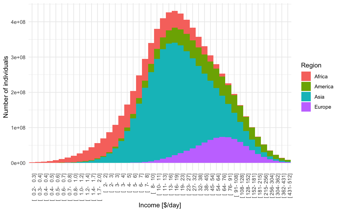
In light of all the talk about gaps, it can also be healthy to plot the income distribution on the linear scale. From this it becomes obvious that linearly there indeed are larger absolute differences in income, but -as argued in the book- the exp-scale (base 2) incorporates peoples perception about the worth of additional income.
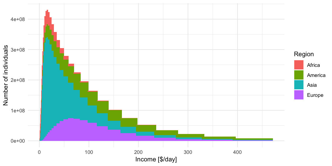 Because the intervals are not equally wide, only the height of the bars
should be interpreted in this plot. However, the eye perceives area,
which in this case is misguiding. Showing histograms with unequal bin
widths is a constant dilemma between area, height, density and
perception. The recommendation would be that if one wants to use the
linear-scale, then one should use equal width linear intervals or
directly plot the density. As a consequence, plots like the above are
not recommended, but they make obvious the tail behaviour of the income
distribution - a feature which is somewhat hidden by the
log-base-2-scale plots.
Because the intervals are not equally wide, only the height of the bars
should be interpreted in this plot. However, the eye perceives area,
which in this case is misguiding. Showing histograms with unequal bin
widths is a constant dilemma between area, height, density and
perception. The recommendation would be that if one wants to use the
linear-scale, then one should use equal width linear intervals or
directly plot the density. As a consequence, plots like the above are
not recommended, but they make obvious the tail behaviour of the income
distribution - a feature which is somewhat hidden by the
log-base-2-scale plots.
Of course none of the above plots looks as nice as the Gapminder plots, but they have proper x and y-axes annotation and, IMHO, are clearer to interpret, because they do not mix the concept of density with the concept of individuals falling into income bins. As the bin-width converges to zero, one gets the density multiplied by \(n\), but this complication of infinitesimal width bins is impossible to communicate. In the end this was the talent of Hans Rosling and Gapminder - to make the complicated easy and intuitive! We honor this by skipping the math1 and celebrate the result as the art it is!
##Make mountain plot with smaller intervals than in previous plot.
ggplot_oneyear_mountain <- function(people, ymax=NA) {
  ##Make the ggplot
  p <- ggplot(people %>% rename(Region=region), aes(x=mid_log2,y=people, fill=Region)) +
    geom_col(width=min(people$width_log2)) +
    ylab("Number of individuals") +
    xlab("Income [$/day]") +
    scale_x_continuous(minor_breaks = NULL, trans="identity",
                       breaks = trans_breaks("identity", function(x) x,n=11),
                       labels = trans_format(trans="identity", format=function(x) ifelse(x<0, sprintf("%.1f",2^x), sprintf("%.0f",2^x)))) +
    theme(axis.text.y=element_blank(), axis.ticks.y=element_blank()) +
    scale_y_continuous(minor_breaks = NULL, breaks = NULL, limits=c(0,ymax)) +
    ggtitle(paste0("World Income Mountain ",max(people$year))) +
    NULL

  #Show it and return it.
  print(p)
  invisible(p)
}

##Create the mountain plot for 2015
gm_recent %>%
  make_mountain_df(log2x=seq(-2,9,by=0.01)) %>%
  ggplot_oneyear_mountain()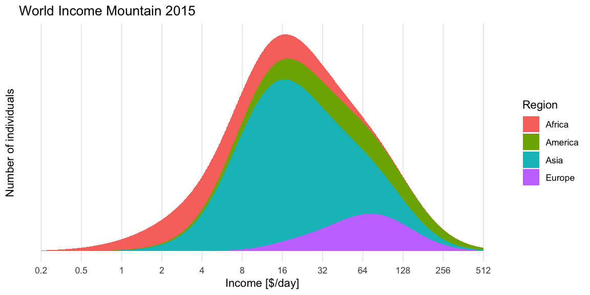
Discussion
Our replicated mountain plots do not exactly match those made by
Gapminder (c.f. the screenshot). It appears as if our distributions are
located slightly more to the right. It is not entirely clear why there
is a deviation, but one possible problem could be that we do the
translation into income per day differently? I’m not an econometrician,
so this could be a trivial blunder on my side, however, the values in
this post are roughly of the same magnitude as the graph on p. 45 in
van Zanden et al.
(2011) mentioned in the Gapminder
documentation page, whereas the Gapminder curves appear too far to
the left. It might be worthwhile to check individual
country data underlying the graphs to see where the difference is.
Edit 2018-07-05: I checked this and read the documentation
again more carefully: Apparently, Gapminder uses mean household
income (or consumption) per person per day (measured in PPP$ 2011)
opposite to the GDP/capita used in the scientific literature
they quote and for which you can download the data from their website.
To me this was not clear when reading Factfulness and, unfortunately,
there is no documentation for how exactly their mean household income
value per individual is computed from the GDP/capita.2 For
the sake of illustrating the dynamics in the world income the difference
in scale is not that important, though.
We end the post by animating the dynamics of the income mountains
since 1950 using gganimate. To put it in possibilistic
terms: Let the world move
forward! It is not as bad as it seems. Facts matter.
Literature
Shown is the expected number of individuals in thin bins of size 0.01 on the log-base-2-scale. As done in Factfulness we also skip the interval annotation on the x-axis and, as a consequence, do without y-axis tick marks, which would require one to explain the interval widths.↩︎
The Gapminder Household Income v1 description is currently (as of 2018-07-05) blank and so is the link specified as reference Gapminder [3] in Factfulness. The detailed data just contain the column
household_incomewithout further explanation. Altogether, a somewhat disappointing number of links in the book are currently still under construction. Reading the document Data Sources used in Don’t Panic — End Poverty it appears to me that the GDP/capita are converted to household incomes by scaling all countries GDPs per capita until the global income log-normal mixture distribution is such that 11.3% of world population are below the extreme poverty line of 1.85$/day (in PPP 2011) in year 2015. When I tried this rather ad-hoc approach I got a scale parameter of approximately 0.379 for the GDP, which corresponds to a shift of 1.402 to the left on the log-base-2 scale. This worked ok for the single benchmark of Sweden in 1970 that I tested. Furthermore, Gapminder uses something they call log-normal-topping per country in order to get better tail behaviour. Adventurous Excel-files not directly linked to in any explanation are used for the calculation and can be consulted for further details. The authors note themselves that they hope to convert these computations to python soon…😄↩︎