Cartograms with R
Abstract
We show how to create cartograms with R by illustrating the population and age-distribution of the planning regions of Berlin by static plots and animations.

 This work is licensed under a Creative Commons
Attribution-ShareAlike 4.0 International License. The
markdown+Rknitr source code of this blog is available under a GNU General Public
License (GPL v3) license from github.
This work is licensed under a Creative Commons
Attribution-ShareAlike 4.0 International License. The
markdown+Rknitr source code of this blog is available under a GNU General Public
License (GPL v3) license from github.
Introduction
Every good lecture on sophisticated statistical modelling starts with
underlining the importance of data visualization as the
first step of an analysis. Choropleth maps
are a common choice for visualizing the spatial distribution of a
feature recorded in administrative regions, e.g., population density or
the incidence rate of a disease. Here, each region is shaded with a
color selected in accordance with the feature variable, e.g., higher hue
if the feature value is higher. Choosing the right palette for such
visualizations is a science of its own, see e.g. Zeileis, Hornik, and Murrell (2009)
or the ColorBrewer project, which
is available in R through the RColorBrewer
package. A nice way to further spice up your spatial visualizations are
area cartograms, where the boundary shape of each
region is warped such that its area becomes proportional to the value of
the feature variable you want to illustrate. The difficult part here is
to preserve the arrangement of the regions, see for example Gastner and Newman
(2004) for the methodological challenges of this task.
In this post we show how such area cartograms can easily be created
with R using the packages Rcartogram and
getcartr together with the powerful packages
sp, rgeos and rgdal for the
spatial data wrangling. Both Rcartogram and
getcartr are only available from github, because the
license of the underlying Cart C
fragment implementing the method of Gastner and Newman (2004) does
not appear to be GPL (or the like) compatible.
The Data
We use population numbers for the 447 planning regions of Berlin (Lebensweltlich orientierte Räume (LOR)). The boundaries of these regions are available as ESRI Shapefile through the open data portal of Berlin under the CC BY license. The 2015 population data of the LORs are available as CSV file through the same data portal.
tmpfile <- paste0(tempfile(),".zip")
download.file("https://www.statistik-berlin-brandenburg.de/opendata/RBS_OD_LOR_2015_12.zip",destfile=tmpfile)
unzip(tmpfile,exdir=file.path(filePath,"RBS_OD_LOR_2015_12"))
download.file("https://www.statistik-berlin-brandenburg.de/opendata/EWR201512E_Matrix.csv",destfile=file.path(filePath,"EWR201512E_Matrix.csv"))
With the help of the rgdal, sp and the
rgeos CRAN packages, R can be used as a geographic
information system (GIS). This allows for easy merging of these two
data sources together with a spatial aggregation to the
Prognoseräume level, which is a slightly higher level
of aggregation than the LORs (60 regions instead of 447). The output of
these data wrangling steps will be a SpatialPolygonsDataFrame object
pgrs - see GitHub code for details.
library(rgdal)
library(sp)
library(rgeos)
##Read shapefile
lor <- readOGR(dsn=file.path(filePath,"RBS_OD_LOR_2015_12"),layer="RBS_OD_LOR_2015_12")## OGR data source with driver: ESRI Shapefile
## Source: "/Users/hoehle/Sandbox/Blog/figure/source/2016-10-10-cartograms//RBS_OD_LOR_2015_12", layer: "RBS_OD_LOR_2015_12"
## with 447 features
## It has 8 fieldsproj4string(lor)## [1] "+proj=utm +zone=33 +ellps=GRS80 +units=m +no_defs"##Compute area of each LOR in km^2 area (unit: meters -> convert to square km)
lor$area <- gArea(lor, byid=TRUE) / (1e6)
##Read population
pop <- readr::read_csv2(file=file.path(filePath, "EWR201512E_Matrix.csv"))
##Merge SpatialPolygonsDataFrame with population information
lor_pop <- merge(lor, pop, by.x="PLR",by.y="RAUMID")Plotting the result of the pgrs object as an instance of
SpatialPolygonsDataFrame can be done using the standard
Spatial* plotting routines documented extensively in, e.g,
Bivand, Pebesma, and
Gómez-Rubio (2008) and its comprehensive webpage.
######################################################################
## Plotting the result, see nice tutorial by
## http://www.nickeubank.com/wp-content/uploads/2015/10/RGIS3_MakingMaps_part1_mappingVectorData.html
## or the Bivand et al. (2008) book - a must read!
## Note: there is a 2nd edition available nowadays.
######################################################################

library(RColorBrewer)
my.palette <- brewer.pal(n = 6, name = "Purples")
##Helper function for making labels for each entry
sp.label <- function(x, label) {list("sp.text", coordinates(x), label,cex=0.5)}
borderCol <- "white"

#Plot choropleth map
spplot(pgrs, "density", col.regions = my.palette, cuts = length(my.palette)-1, col = borderCol,main="Choropleth map of Population Density",sp.layout=sp.label(pgrs, pgrs$EXTPGRNAME))
require(grid)
grid.text(expression("Population density (Persons / "~km^2~")"), x=unit(0.95, "npc"), y=unit(0.50, "npc"), rot=-90)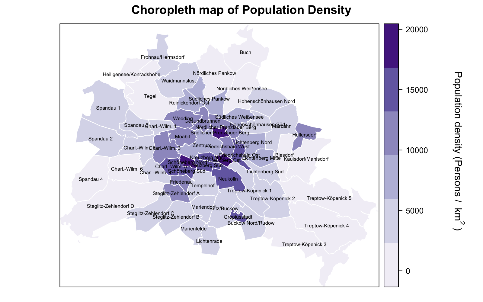
Installing the Cartogram R packages
Two packages Rcartogram and getcartr make
the functionality of the Gastner and Newman (2004)
procedure available for working with objects of class
Spatial*. Installing Rcartogram requires the
fftw library to be
installed. How to best do that depends on your system, for Mac OS X the
homebrew package system makes this
installation easy.
##On command line in OS/X with homebrew. Wrapped in FALSE statement to not run system() unintentionally
if (FALSE) {
  system("brew install fftw")
}
##Install the R implementation of Cart by Gastner and Newman (2004)
devtools::install_github("omegahat/Rcartogram")
devtools::install_github('chrisbrunsdon/getcartr',subdir='getcartr')
We are now ready to compute our first cartogram using the
getcartr::quick.carto function.
library(Rcartogram)
library(getcartr)

##Make a cartogram
pgrs_carto <- quick.carto(spdf=pgrs,v=pgrs$E_E,res=256)

##Display it using sp functionality
spplot(pgrs_carto, "area", col.regions = my.palette, cuts = length(my.palette)-1, col = borderCol,main="Population Cartogram as Choropleth of Area",sp.layout=sp.label(pgrs_carto, label=pgrs_carto$EXTPGRNAME))
grid::grid.text(expression("Area (km"^2*")"), x=unit(0.95, "npc"), y=unit(0.50, "npc"), rot=-90)
With the cartogram functionality now being directly available through
R allows one to embedd cartogram making in a full R pipeline. We
illustrate this by generating a sequence of cartograms into an animated
GIF file using the animation package. The animation below
shows a cartogram for the population size for each of the 32 age groups
in the Berlin data set. One observes that the 25-45 year old tend to
live in the city centre, while the 95-110 year old seem to concentrate
in the wealthy regions in the south west.

Outlook
While writing this posts some other useRs have posted on how to create interactive cartograms.